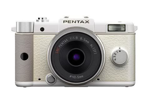
So, first look at the new Qs:-

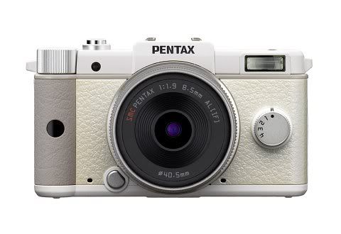
And compare it to the last similar designed (for its appearance) Digital I-10:
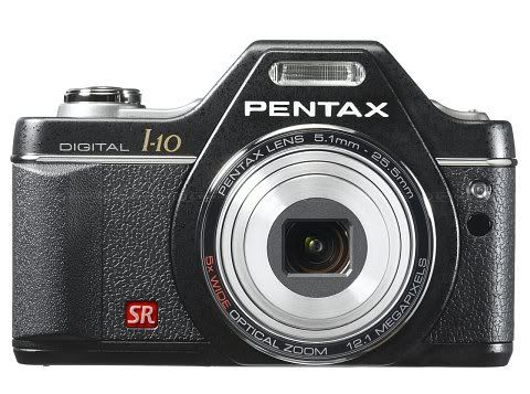
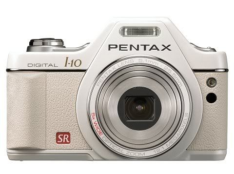
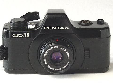
IMO, without any doubt, the I-10 does look better, and so does the old Pentax Auto 110 which the I-10 emulates:-
So, what has been going wrong actually. Look at the following, do you actually find my design improves something, even it could not eliminate all the problems? Enjoy~! ;-D
(Below: Click to Enlarge)

Related:-
The Pentax Q Announced!